A familiar scene in many companies: fifteen people crammed into a room designed for eight, half unable to see the presentation screen, and the acoustics so poor that those at the back are constantly asking for things to be repeated. Three hours are wasted on a decision that should have taken thirty minutes. This all-too-common situation highlights a truth many organizations overlook: meeting room layout is not just about aesthetics, it is a real driver of productivity.
The numbers back it up. Studies show that managers spend around three hours a day in meetings. Over a forty-year career, that adds up to thousands of hours spent in these collaboration spaces. Yet statistics reveal that a company with ten employees loses an average of €58,725 per year due to unproductive meetings. Much of this waste can be traced back to poorly designed spaces.
Too many companies still treat their meeting rooms as nothing more than a table and some chairs. That is a strategic mistake. These spaces are actual stages where key decisions are made, innovations take shape, and team relationships are built. And just like any stage, the way it is set up makes a huge difference.
A poor layout creates invisible but damaging obstacles: some participants are visually excluded from the discussion, others cannot make eye contact with the facilitator, and a few struggle to take notes comfortably. The result is disengagement, misunderstandings, unclear decisions, and a general sense that time has been wasted.
On the other hand, a well-designed layout naturally supports communication, encourages everyone to participate, keeps attention focused, and speeds up decision-making. The difference between a productive meeting and wasted time often comes down to a few centimeters: the angle of a chair, the distance between participants, and the visibility of the screen.
Before exploring different layout options, it’s important to understand the factors that should guide your choice. There is no one-size-fits-all arrangement: each meeting has its own needs.
This seems obvious, yet it is frequently ignored. How many times do we see twelve people squeezed into a huddle room designed for four, or three employees lost in a thirty-seat conference room?
Room capacity is more than just the number of chairs you can fit. You need to consider circulation space, the minimum distance between participants to avoid a cramped feeling, and space for equipment such as screens, whiteboards, and video conferencing tools.
A practical guideline is to allow at least 2 square meters per person for a comfortable setup. Anything less can create a sense of overcrowding that hinders focus and creativity.
A creative brainstorming session is very different from a technical training, which in turn differs completely from a client presentation. Yet many companies use the same layout for all these formats. Here’s a breakdown of the main meeting types and their specific requirements:
Do you want participants to interact with each other, or mainly listen? This fundamental question has a major impact on the optimal layout.
For maximum interactivity, participants should be able to make direct eye contact with one another. Simply being able to see each other’s faces significantly boosts engagement and the quality of discussions. Conversely, if the goal is mainly one-way information delivery, an auditorium-style setup may be more appropriate.
Technological tools are no longer a luxury – they are essential. But they bring their own requirements. A video conferencing screen must be visible from every seat. Power outlets should be accessible without creating a tangle of cables. Lighting needs to be adjustable to suit video presentations.
Too many companies invest in expensive equipment only to place it haphazardly, making it difficult to use. A state-of-the-art 4K screen is useless if half the participants have to crane their necks to see it.
Huddle rooms have become increasingly popular in recent years, and for good reason. These compact spaces of 10 to 15 square meters meet a growing need: quick alignment sessions, focused informal discussions, and work sessions in pairs or small groups of three.
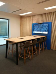
For 4 to 6 people, a round table is a reliable choice. There is no head of the table, no visual hierarchy, and everyone is on equal footing. Each participant can see everyone else, read facial expressions, and pick up on non-verbal cues. This setup naturally fosters trust and openness.
A common mistake is choosing a table that is too large. For 4 people, a diameter over 1.2 meters begins to create a psychological barrier. Voices don’t carry as well, shared documents in the center become harder to read, and the intimacy of the group is lost.
For one-on-one or pair interactions, two configurations are common: direct face-to-face and angled at 90 degrees. The direct setup creates a more formal, sometimes confrontational dynamic, making it suitable for evaluations or negotiations. The angled arrangement softens interactions and encourages collaboration, making it ideal for mentoring or coaching sessions.
The compact nature of huddle rooms brings a few hidden challenges.
Acoustics: In a small space, voices echo, air conditioning is noticeable, and external noise can be disruptive. Investing in sound-absorbing materials such as panels, carpeting, or wall fabrics is essential.
Ventilation: Six people in a 12-square-meter room for an hour can quickly lead to high CO2 levels, reducing focus and the quality of thinking. Effective ventilation is crucial.
Lighting: Many huddle rooms rely solely on harsh overhead lights. Lighting should be sufficient for comfortable work without causing glare. A combination of indirect lighting and adjustable task lights makes a significant difference.
This is the critical size for many project teams, departments, and cross-functional working groups. These 20 to 30 square meter rooms must accommodate a variety of uses.
The open horseshoe or U-shape remains one of the most versatile layouts for this size. Why does it work? Because it combines the benefits of several configurations:
Proper sizing is crucial. The arms of the U should be long enough to accommodate everyone comfortably but not so long that people at the ends feel excluded. A depth of 3 to 4 meters for the entire U strikes a good balance for 10 to 12 participants.
Less common than the U-shape, the V-shaped layout offers similar benefits with a more energetic feel. The two arms form a sharper angle, naturally focusing attention on the focal point. This setup works especially well for presentations requiring high engagement, such as product demos, client pitches, or interactive training sessions.
A large central rectangular table can work, but common mistakes should be avoided. For 10 people, the ideal length is 3 to 4 meters. Any longer, and participants at the ends struggle to communicate effectively. Width also matters: a table wider than 1.2 meters creates too much distance between people seated opposite each other.
Managing “power seats” is crucial. The ends of the table automatically confer a special status. If you want an egalitarian dynamic, leave these seats empty or use them for equipment such as a screen or whiteboard. If you want to emphasize hierarchy, as in board or executive meetings, assigning these seats becomes a deliberate act of communication.
Once you go beyond a dozen participants, the challenges shift. The goal is no longer just to encourage interaction but to structure communication so it remains effective despite the larger group.
For 15 to 20 people at most, a full-circle setup is appealing for its apparent equality. In theory, everyone can see each other, and no one dominates. In practice, this layout has important limitations.
First, it requires a lot of space. A comfortable circle for 20 people (about 60 cm per person) needs a diameter of roughly 4 meters, or at least 50 square meters when accounting for circulation. Many organizations underestimate this and end up with cramped circles that negate the benefits.
Second, discussion dynamics become more complicated. In a large circle, making clear eye contact with someone across the room takes conscious effort. Conversations tend to fragment into small side discussions between neighbors, and the lack of a natural focal point makes it harder to keep the discussion structured.
Despite these challenges, this layout works well for certain purposes: important announcements that require dialogue, team-building seminars, plenary meetings with exchange time, and 360° feedback sessions. In these cases, facilitation is key to keeping everyone engaged.

Rows of tables facing forward, with aisles for circulation, maximize seating capacity and ensure clear sightlines to a single focal point. For technical training, internal conferences, or any meeting where information flows mainly in one direction, this layout is hard to beat.
Proportions matter. The spacing between rows should allow movement without disturbing seated participants (at least 80 cm). The room’s depth should not exceed 10 meters; beyond that, even with good sound systems, attention in the back rows drops sharply.
The limitations are clear: this setup stifles horizontal interaction. Participants barely see each other, communicating across aisles is difficult, and working in small groups requires a complete rearrangement of the space. It is best reserved for sessions designed for one-way communication.
A tip from experienced trainers: slightly curve the rows in an arc toward the front. This simple adjustment improves visibility, enhances acoustics, and gives participants a peripheral view of their peers, increasing their sense of belonging to the group.
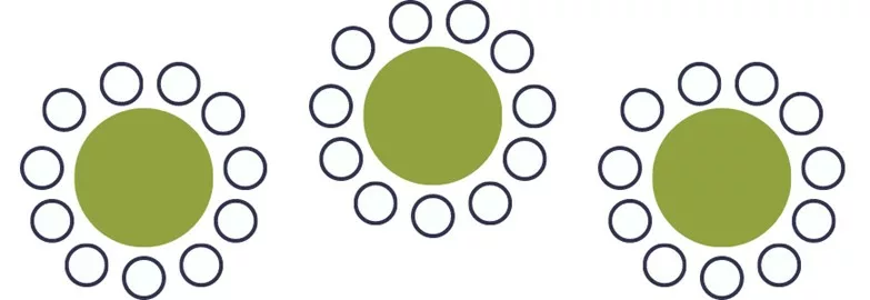
Round tables seating 6 to 8 people scattered throughout the room draw inspiration from festive events to create a more relaxed atmosphere. Each table forms a micro-team, encouraging close interaction while still allowing for plenary contributions.
This layout works well in a variety of contexts: professional networking sessions, team seminars with breakout workshops, trainings that alternate between theory and group practice, and client events that combine presentations with discussion.
Space planning is more complex. Each 1.5-meter-diameter round table requires about 9 square meters, including chairs and circulation space. For a 60-person banquet setup (10 tables of 6), you need at least 90 square meters, ideally 120 to allow comfortable movement.
Table placement deserves careful thought. Aligning all tables strictly in rows recreates rigidity and negates the benefits. Staggered or slightly offset arrangements maintain structure while breaking monotony. Tables should also be oriented toward the focal point, such as a screen or stage, so that at least half of each table’s participants can see without turning completely around.
A less common but highly effective setup for certain formats, this layout arranges chairs in concentric circles without tables. It combines the seating capacity of a classroom with some of the engagement benefits of a circle.
It is particularly well-suited for company town halls, plenary meetings with Q&A sessions, results presentations that encourage dialogue, and organizational change events. The absence of tables creates a less formal atmosphere and helps focus attention on the center.
The setup comes with significant requirements: a high-quality sound system, circulating microphones for audience questions, and adjustable lighting to create different moods for each part of the session. This configuration quickly exposes any technical shortcomings in a room.
Faced with diverse needs, one trend is becoming clear: modularity. Rather than maintaining multiple specialized rooms – which is costly in terms of space and management – more organizations are opting for reconfigurable spaces.
Furniture is key. Heavy wooden tables and built-in cabinets are out. High-quality folding tables (not cheap models that warp after a few months), thoughtfully designed stackable chairs, and movable acoustic partitions are in.
However, beware the “everything must be modular” trap. An entirely empty room with stacked furniture in a corner is not a modular room – it’s an empty room that takes fifteen minutes to set up before each meeting. No one will do that. True modularity relies on functional default configurations that can be quickly transformed (within five minutes) into other common layouts.
Mobile screens on rolling stands have replaced fixed wall installations. This investment pays off by allowing the screen to be positioned exactly where it’s needed for each layout. Quality is crucial—a wobbly stand or stuck wheels can turn an advantage into a headache.
Portable video conferencing systems eliminate the need for expensive installations in every room. A medium-sized company can manage with 2–3 fully equipped carts (camera, microphone, screen, control system) shared between multiple rooms.
Electrical wiring deserves careful attention. Flexibility should not come at the cost of a tangle of extension cords on the floor. Professional solutions include retractable cable ducts, flush floor boxes, or ceiling-mounted electrical rails with adjustable drops.
Large rooms with sliding partitions offer remarkable versatility. A 60-square-meter space can be divided into two 30-square-meter rooms or three 20-square-meter spaces. This is ideal for training sessions with breakout workshops or to optimize space usage based on attendance.
Acoustic insulation quality makes all the difference. Low-grade partitions let sound pass through, making simultaneous use of separate spaces impossible. Professional systems with automatic seals and double walls achieve soundproofing comparable to a solid wall. The cost is significant – roughly 300 to 600 euros per linear meter installed – but the return on investment in flexibility is rapid.
Beyond layout, several technical elements can determine whether a meeting room succeeds or fails. These aspects are frequently forgotten during initial design but become major irritants in daily use.
How many modern rooms, with their sleek designs, glass surfaces, and hard floors, end up sounding like cathedrals? Voices echo, overlap, and create fatigue. After an hour of meeting, participants are exhausted- not from the content, but from the constant effort to understand speech in the amplified noise.
Reverberation time – the period a sound persists after being emitted – should ideally be between 0.4 and 0.8 seconds in a meeting room. Beyond that, comprehension drops sharply. Unfortunately, many rooms exceed 1.5 seconds, sometimes even 2 seconds.
Solutions exist but need to be integrated from the start. Wall-mounted acoustic panels—truly absorbent with an alpha coefficient above 0.7, not just decorative – porous ceilings, suspended elements, and acoustic rugs or carpeting all help. Retrofitting these solutions later can cost two to three times more than incorporating them in the initial design.
A uniform 500 lux across a room, common in many offices, is not ideal for meeting spaces. Different zones require different levels: strong lighting on the worktable (400–500 lux), dimmer lighting in the projection area (100–200 lux), and adjustable ambient lighting for breaks or informal discussions.
Lighting control systems (DALI or similar) allow pre-programmed scenarios: “presentation” (dimmed overall lighting with focus on the presenter), “collaborative work” (even, bright lighting), and “video conference” (optimized facial lighting). The initial investment pays off in user comfort and energy savings.
Color temperature also matters. Lighting that is too cool (over 5000K) feels clinical and increases eye fatigue, while lighting that is too warm (under 3000K) can make participants drowsy. The ideal range is 3500K–4500K, with the ability to adjust throughout the day – slightly warmer in the morning to help wakefulness, softer in the late afternoon.
Studies on cognitive performance are clear: above 25°C, concentration and decision-making abilities gradually decline. At 28°C, performance drops by roughly 10%. Conversely, below 20°C, physical discomfort distracts participants and reduces engagement.
The optimal range is 21–23°C with relative humidity between 40 and 60%. Easy to state, but difficult to maintain in a room where six, ten, or twenty people each emit the equivalent of a 100-watt radiator.
Undersized air-conditioning systems are common. Many companies calculate cooling needs based on floor area alone, ignoring heat generated by occupants and equipment (a projector easily adds 500 watts). The result: stifling rooms in summer, often leading to open windows and a loss of acoustic insulation.
Air quality, particularly CO2 levels, directly affects cognitive performance. Beyond 1000 ppm, complex thinking starts to decline. At 2500 ppm – unfortunately common in poorly ventilated rooms – performance drops significantly. A double-flow ventilation system with CO2 monitoring is no longer a luxury but a productivity investment.
A modern meeting room without reliable Wi-Fi is an empty shell. But Wi-Fi alone is no longer enough. Wireless screen sharing, video conferencing systems, and collaborative work on shared documents require bandwidth and stability that Wi-Fi alone may struggle to provide.
The ideal setup combines sufficient Ethernet connections (at least one for every two seats) with a mesh Wi-Fi system featuring multiple access points to eliminate dead zones. Network outlets should not be limited to the room’s perimeter but accessible at tables or via floor boxes.
A common frustration is when the first person to arrive monopolizes the only two available power outlets. Plan for at least one outlet per person, ideally two (laptop and phone). Table cable channels with integrated outlets every meter provide an elegant solution.
When to call in a professional
Outfitting one or two small meeting rooms can be managed with common sense. But as soon as you’re designing an entire floor, creating modular spaces, integrating audiovisual systems, or optimizing an underused room portfolio, complexity rises rapidly.
For a fully functional, turnkey meeting room, our experts are ready to help.